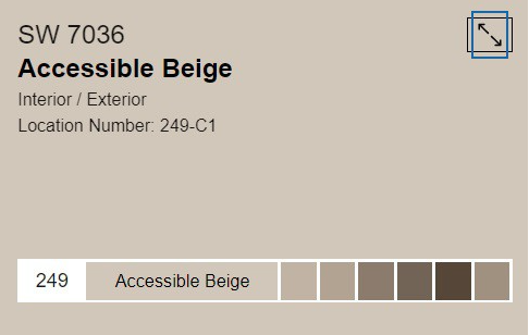
Accessible Beige SW: Popular Neutral Paint Color Review

If you are looking for a good neutral without any blue or yellow undertones, accessible beige SW 7036 is the perfect paint color for you. In fact, it’s one of the most popular Sherwin Williams paint colors because of its versatility and it happens to be one of my favorites as well!
In this blog post I will be sharing more of why I love accessible beige so much and the other coordinating paint colors it pairs nicely with.
Accessible Beige Sherwin Williams SW 7036

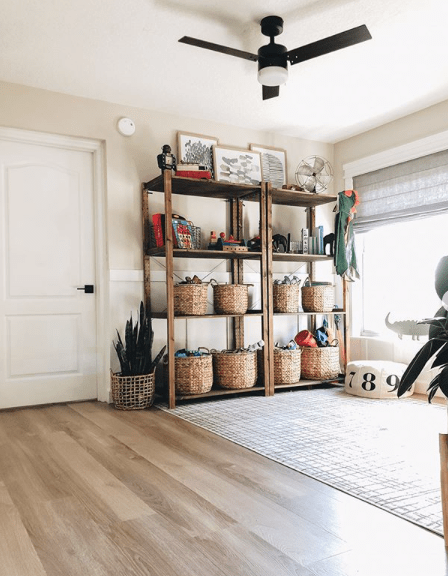

Playroom via Within the Grove with accessible beige on the upper walls lightened 50%
Where Can You Use Accessible Beige
Accessible beige is versatile and can be used in any room in the house with the right complimentary selections (flooring, tile, etc.)
I’ve seen it used in:
- kitchens
living rooms
bathrooms
dining rooms
bedrooms
entrys
kitchen or vanity cabinetry
even exteriors
You really can’t go wrong and can use it anywhere!
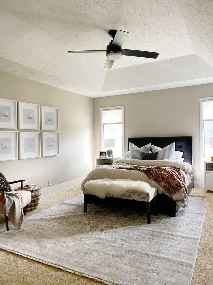
For my own home, I prefer to keep things simple neutral and calm. We used accessible beige for our master bedroom walls and it’s the perfect color. It’s that in between color where it’s not quite gray it’s not quite beige. I wanted warm and cozy in our bedroom with some depth in the wall color rather than going with white. Our bedroom windows face east so we don’t get a ton of natural light in the evening but the color looks great throughout the whole day. I love it!

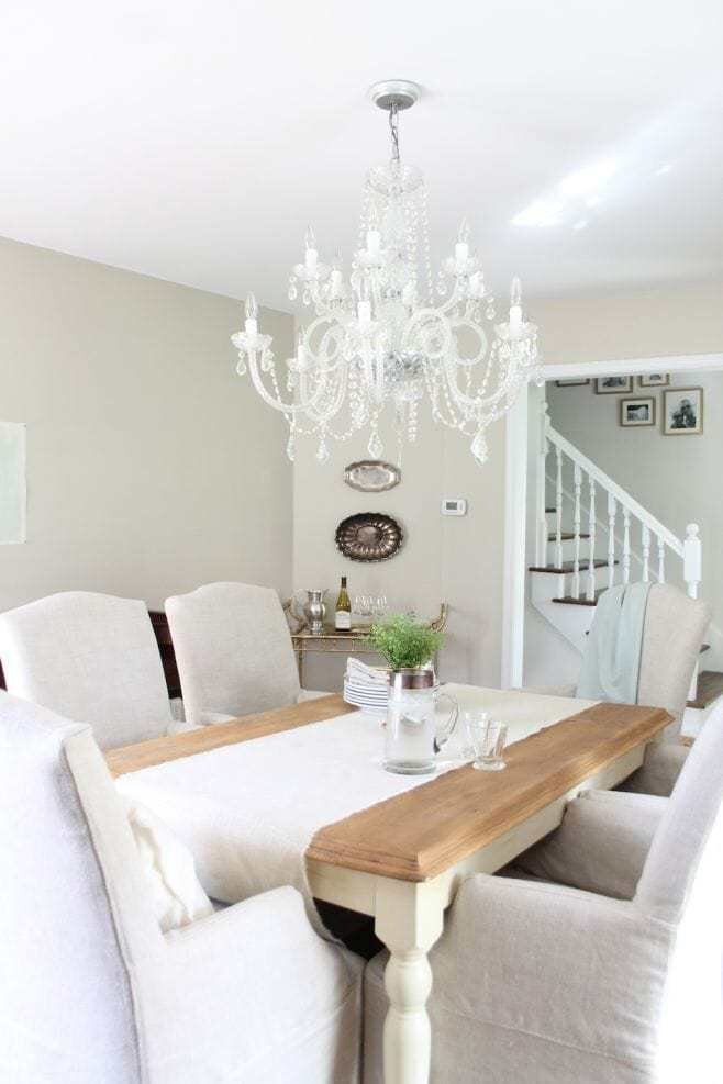

Dining Room with Accessible Beige on the walls via Julie Blanner
Click here to see the 6 best white paint colors for trim.
Since accessible beige is a bit of a chameleon color, it is well suited for just about any house style. It can go with the traditional dark wood flooring and trim from modern white painted, to a honey oak floor and trim. Below is an example with accessible beige on the walls and honey oak on the railings.
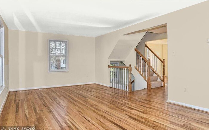

image source unknown
Does Accessible Beige Go With Honey Oak?
Since honey or golden oak has an orangey yellow undertone, it’s best not to pair it with a paint color that has any pink undertones. Side by side the undertones in either color appear “muddy” or dirty and most likely that is not the look you are going for. Accessible beige does not have any pink undertones so it’s a safe color to use with honey oak and will look very pretty!
For tips on identifying undertones in paint colors, check out this blog post. Just looking at your paint color in a fan deck compared to the other colors will help you quickly pinpoint what undertones you see. Don’t feel bad if you can’t identify the undertones in paint colors right away, some colors are tricky and if you aren’t looking at paint colors every day it can be confusing!
You can use undertones in paint colors to your advantage depending on the overall look you are going for. If your goal is to neutralize golden oak or downplay it, it’s best to choose a color that is cream, beige or brown so it doesn’t have much contrast. If you want to accent your golden oak and make it stand out, choose a cool undertone. Pairing a cool undertone with warm golden oak is a high contrast and makes it stand out and helps offset all the warmth.
Complimentary Paint Colors
Accessible beige is neutral and very versatile so it works nicely with MANY colors! It’s closest relative is Agreeable Gray SW which has a touch more gray in it.
Another close relative is Balanced Beige – a slightly darker version of AB.
Revere Pewter Benjamin Moore is another similar color to AB but with a hint more gray in it and less warmth. I have revere pewter on our kitchen island and more subtle and has less depth than AB.
Other complimentary paint colors are:
warm grays that are darker than AB
cool grays that are darker than AB
If you’re looking for a white paint color for trim and baseboards, check out this blog post where I share the 6 best white paint colors for trim. Any of these 6 paint colors will look great with accessible beige including SW Alabaster, SW Pure White and BM Simply White.
Sample Paint Colors
The only true way to find out if accessible beige is right for you is by testing it. I like to do this by buying a quart and painting a small amount to on the walls and looking at it during different times of day to see how it looks when light hits it and make sure it doesn’t fall too yellow or gray. Another great option for testing a paint sample is by these peel and stick sample sheets you can stick right on your wall! Super simple snd mess free! No matter what I’m painting, I always test the sample color first before buying a gallon so I can be sure it looks right. I can’t tell you how many times I’ve heard clients say that they picked out a paint color based on the paper swatch and painted the whole room. Only to find out they don’t like the paint color and how it looks. Paint colors can act finicky and look totally different in a room than on the little swatch. For example, colors in north facing room always tend to fall a tad cool. Moral of the story is always do a sample test on your walls before committing!
Doing some painting in your home? You might like these related posts:
How to Paint Baseboards and What Kind of Paint to Use
6 Best White Paint Colors for Trim & Doors


